The snapshot analogy
Polls are blurry snapshots
When explaining polls, given the challenge of using numbers with people who may not be comfortable with them, people in the field use the “snapshot” analogy.
Like most analogies, there are limitations; unlike most analogies, there aren't many with this one!
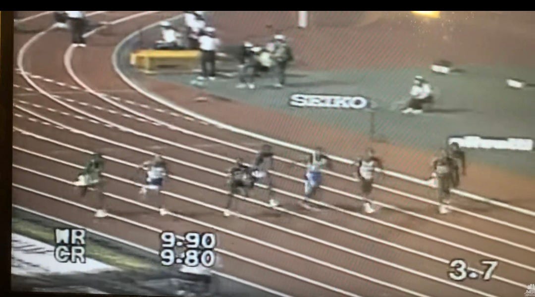
By using literal footraces, we can expand the analogy to how polls are used: who is ahead, and by how much?
If you follow my page, you hopefully already know that “spread” or “margin" is a junk metric when it comes to analyzing polls.
The reason why, when we talk about a race, is simple:
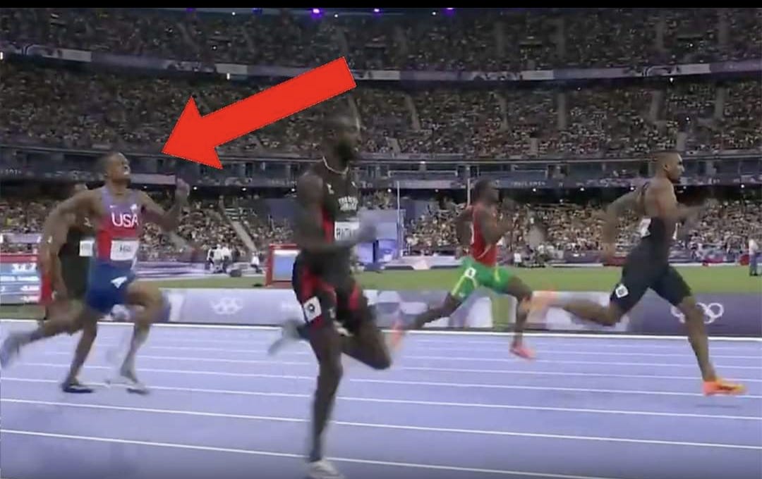
In that snapshot above, you can clearly see the answers to both questions. You might not be able to perfectly estimate with the naked eye exactly how far ahead the leader is, but there's no disputing who is ahead.
So does this snapshot predict the leader will win?
Again, people (non-experts included) quickly understand the flaw in this reasoning, when we use the snapshot analogy: the race has some time left, so no, the snapshot doesn't predict who will win, or by how much.
This is, sorry to say, so obvious that literal children have pointed out how wrong I was when I tried to convince them that some snapshot predicts some result.
In my discussions with very smart people who don't work in this field, they are understandably skeptical when I tell them that experts in this field don't understand such a basic concept of “how polls work.”
Admittedly, for years, I assumed it was just a way of oversimplifying a (not-that) complex topic so it was suitable for mass public consumption. I was wrong.
It's hard to believe, but there is mountains of evidence to support the fact that experts in this field really, truly, actually think that polls are supposed to predict both the result, and the margin of victory. You can only ignore their words for so long before you reach the difficult conclusion that they're clueless.
This, from 2016, an article co-written by Harry Enten who is now teaching people about polls and stats on CNN, which concluded that “the polls missed” because the person who was winning didn't eventually win!
This is, of course, no different than saying the photographers who took this picture must have done something wrong (or that the picture itself was wrong) when the person they photographed in the lead doesn't win - or doesn't win by as much as the picture showed.
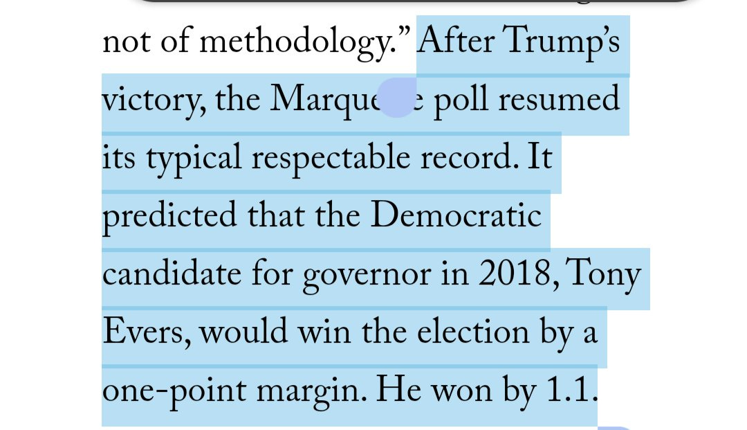
G Elliott Morris, new head of political stuff over FiveThirtyEight, wrote a book in which he outright and incorrectly stated a poll predicted how much someone would win by.
Nate Silver, the largest promoter of the “spread” fallacy, said while at FiveThirtyEight we can measure the accuracy of polls by the margin (or spread) of the poll versus result.
And if that's not enough to convince you that this is a systemic problem, a panel of bonafide, credentialed and degree-carrying experts hired by the American Association of Public Opinion Research (AAPOR) were tasked with figuring out what went wrong with the polls in 2016.
In their report, these experts worked together to outright state on MANY occasions, that polls can be interpreted to predict results and/or margins of victory. A selection:
The report implies this problematic, invalid conclusion hundreds of times more - but to avoid the need for debate over what they truly meant, it's much easier to just limit to the most egregious errors.
“Polls predicted the wrong winner.”
“Predicted margin of victory in polls”
I really can't believe this is a real thing not written by a D+ high school stats student.
So here we are with the uncontested experts in the field, plus the people who have the largest reach within it and are responsible for informing the public about polls, being indisputably and objectively wrong about them.
The bad news: the public is being actively misinformed. In order to fix it, a whole lot of people whose livelihoods have been built around junk math will need to face some sort of reckoning.
I'm not cheering for that outcome, but it'd be nice if there were some sort of accountability in this allegedly scientific field. And an effort to fix their spreading of misinformation.
The good news: the basics really are not that hard.
The blurry snapshot
With my book coming out soon, I've had a lot of people who wouldn't normally be interested in my work ask me about it.
The book isn't dense with numbers by any means.. but it does contain *gasp* some numbers.
So in explaining how polls work, I've stumbled upon an even better analogy: the blurry snapshot.
(It's likely that I borrowed the analogy from Laurence)
The snapshot is a perfect starting point. We understand that just because someone is ahead in one moment, doesn't mean they will be in some future one. The snapshot doesn't predict that, of course. Got it.
Well, here is where the analogy reaches some limitations:
This “snapshot” doesn't actually exist with poll data. It's a useful reference, and a useful analogy to start with - but it is literally impossible, using a poll, to produce a snapshot.
Why?
All polls, by definition, have a margin of error.
I have defined a poll whose only source of error is the margin of error itself as an ideal poll.
This gets a chapter in my book - because there's a little explanation and story behind the terminology and reason why this needs to be defined - but the gist is that simple: the best a poll can possibly be, even if it has zero other error, STILL has a margin of error.
So instead of a snapshot (intro) we have to think of them as blurry snapshots (intermediate).
Usefully for the analogy, any snapshot (blurry or otherwise) can introduce sources of error many people overlook, just like with polls.
For example, how does the angle or perspective from which the snapshot was taken influence our ability to interpret its results?
Nonetheless, considering that polls (at their absolute best) are blurry snapshots, we have to consider the “margin of error” in them.
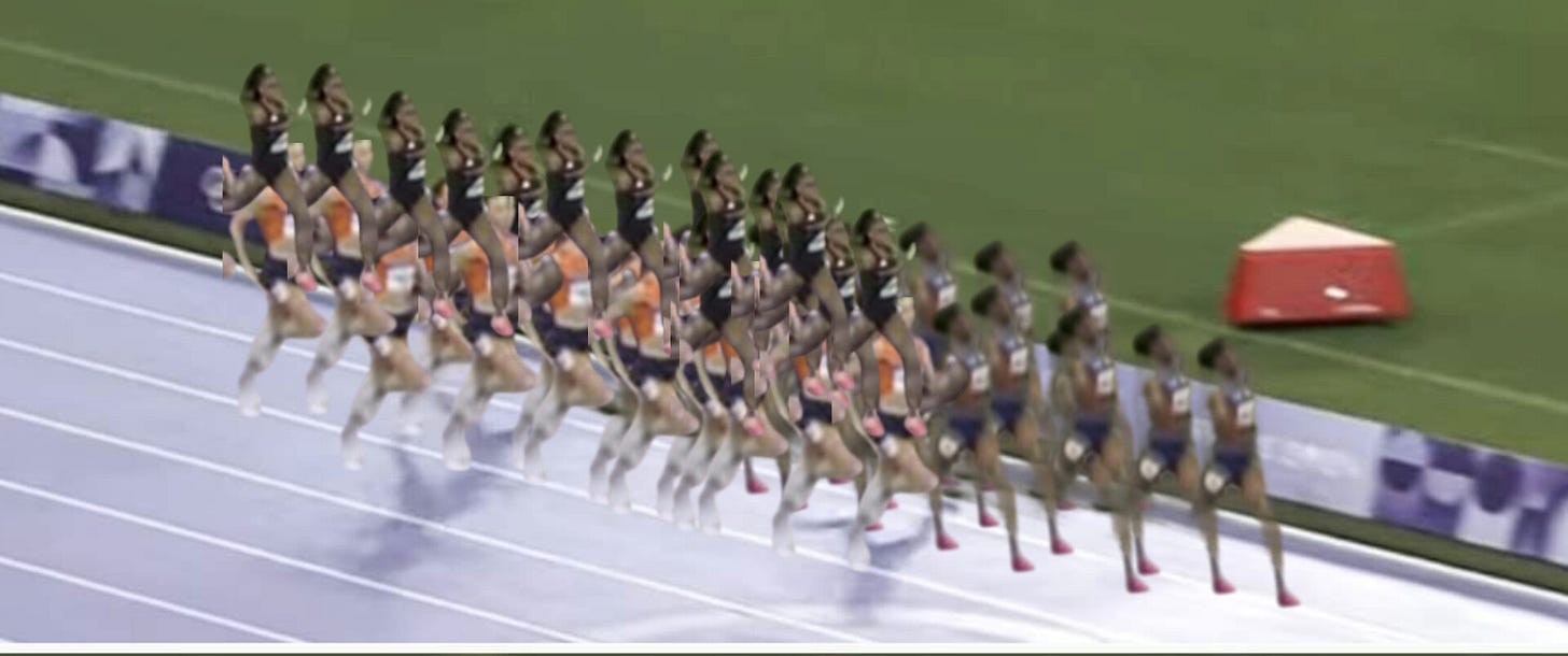
The first photo on this article featured three women in a race. But if that snapshot were as imperfect as an IDEAL poll (no other possible error other than the margin of error itself)
That blurry snapshot would look something like this:
Now, the question of “who is ahead” and “by how much” isn't so clear, is it?
We can, possibly, have some amount of confidence that the runner whose blur is mostly at the front here is CURRENTLY (building on the static snapshot analogy, not mistakenly using it as a prediction) leading.
But by how much? A little or a lot? Would you stake your career on it?
The truth is, it's hard to say.
Worse yet, while you would not define the accuracy of this blurry snapshot by whether or not the perceived leader wins, the experts in this field do. And they tell the public they should, too.
And all that ignores the reality that it's possible, given this data, that the perceived leader isn't leading at all.
The same can be said for polls. Just because a poll or polls say someone is “ahead” doesn't mean they are, not EVEN RIGHT NOW.
The above analysis alone, while objectively correct (both in analogy and application), contradicts the very foundation of analysis currently used by experts.
Do I get a medal?
But that's not the end of it!
Oh lordy, there's more.
Just because polls are not predictions doesn't mean we can't or shouldn't use them to inform our predictions.
We just have to understand their limitations, and assign error appropriately. No, just because poll(s) say someone is ahead, and they don't eventually win, doesn't mean it was wrong.
Limitation number one is the snapshot analogy - polls can't predict the future, nor do they even try to. Many experts paradoxically try to claim they understand this while verbatim demonstrating they do not.
Limitation number two is the blurry snapshot analogy - aka the ideal poll standard - which states that even in IDEAL circumstances (which political polling rarely is) we STILL have to be very uncertain about our “snapshot” - hence the blurry snapshot.
Third - in keeping with the footrace analogy - is the finish line.
In a standard footrace, especially in the Olympics, both observers and participants know with certainty where the finish line is.
So, let's do another intro to polls class:
In an election where the winner is determined by who gets the most votes, if a candidate has received 50% +1 votes, then they win.
Chapter 24 is literally one page long and quite cheeky. But not without reason.
Of course, if you receive 50% plus one votes in any election where the most votes wins, you win. It doesn't matter if there are 2 candidates or 200.
In a two-way race, we know with certainty where the finish line is.
But electoral math is not usually that simple.
As any fan of Olympic races can attest (with many race winners being determined by hundredths or tenths of seconds) knowing with certainty where the finish line is makes a difference - both for the participants, and our ability to observe it.
Limitation number three:
In elections with more than two candidates, the finish line is also blurry.
Here is where the blurry snapshot analogy starts to break down, because races have predetermined finish lines, whereas the finish line in elections quite literally depends on how much support all the participants get, even those who have no chance of winning.
For example, if I enter a 100m sprint contest with two Olympians who, for some reason, still have incentive to try - my performance in no way changes where the finish line is: 100m.
It's indisputable that aside from their getting injured I would finish in last place, by a lot, but this has no impact on their finish line.
But in elections, it does!
The finish line in a head-to-head, two-way race is 50% +1.
For purposes of the analogy, let's call this 50% +1 finish line “100m”
But for some reason, I'm in this race. While I have zero chance of winning, my mere existence and participation in it, because of the rules in this silly contest, moves the finish line.
The amount the finish line moves is directly proportional to my performance in the race.
If I am very, very slow - barely out of the starting blocks as they near the end - their finish line doesn't move much. But it still moves!
Similarly, a weak but existent third-party candidate, who pulls even a trivial 2% of the vote, moves that race’s finish line!
No longer is the race to 50% + 1, fighting over 100%, but their race is now only to 49% +1, fighting over 98%!
Analogously, the race's finish line would be at 98m, not 100m.
While that doesn't seem like much, again, the outcome of many races can be directly impacted by this.
And this doesn't get into how badly current methods mangle the analysis of poll accuracy when third-parties perform unexpectedly well: see chapter 27.
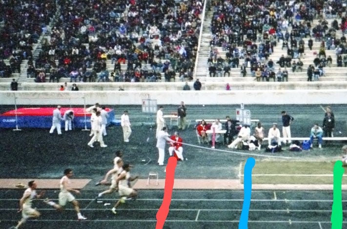
Your ability to interpret this (intro level) snapshot directly depends on knowing where the finish line is.
If I ask you to find a probability that the current leader wins - and how much he might win by - your accuracy will directly depend on knowing whether the finish line is red, blue, green, somewhere in between - or not pictured.
That “blurry finish line” doesn't exist in real races - but certainly does in political ones.
Ironically - or maybe not ironically at all given how math works - the foundations I provide in the book which I've touched on in this article directly lead to being able to better predict election results using poll data. That's not the intent of the book, but it is a pretty pleasant side effect: properly interpreting a tool will offer better results than improperly doing so.
This is not because polls are predictions, but because they are, properly understood, the best tools we have for informing those predictions.
In other words, a blurry snapshot from a race, while wholly incapable of telling you its current state with certainty, definitely offers some insight into predicting that race’s future state. An estimate of a current state is not a prediction of its future state, but it is the best data we can have to inform that prediction (see chapters 5, 15, 22, 28, and 29)
You can pre-order my book here: https://www.amazon.com/gp/aw/d/1032483024


